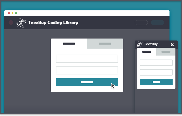
Users Login/Signup Modal Window for Users

This modal window allows users to login/signup into your website. Once opened, the user can easily switch from one form to the other, or select the reset password option.
This resource can be particularly useful if you want to make the login/signup forms available to your users in each page of your website; users won’t be redirected to another page and will be able to continue with the task they were performing on that page.
The resource consists of a front-end coded version of the modal window.
The resource consists of a front-end coded version of the modal window.
Creating the structure
We inserted the Login/Signup links in our main menu:
<nav class="main-nav">
 <ul>
  <!-- all your main menu links here -->
  <li><a class="cd-signin" href="#0">Sign in</a></li>
  <li><a class="cd-signup" href="#0">Sign up</a></li>
 </ul>
</nav>
For the modal window, we created two nested
, one ( the external one ) to cover the entire window, and the other to wrap the submission forms.
Inside the modal, we added a form switcher:
Inside the modal, we added a form switcher:
<div class="cd-user-modal"> <!-- this is the entire modal form, including the background -->
 <div class="cd-user-modal-container"> <!-- this is the container wrapper -->

  <ul class="cd-switcher">
   <li><a href="#0">Sign in</a></li>
   <li><a href="#0">New account</a></li>
  </ul>

 </div>
</div>
and the submission forms:
<div class="cd-user-modal">
  <div class="cd-user-modal-container">

    <!-- switcher tab here -->

    <div id="cd-login">

      <!-- form here -->

      <p class="cd-form-bottom-message"><a href="#0">Forgot your password?</a></p>
    </div>

    <div id="cd-signup">

      <!-- form here -->

    </div>

    <div id="cd-reset-password">

      <!-- form here -->

      <p class="cd-form-bottom-message"><a href="#0">Back to log-in</a></p>
    </div>
  </div>
  <a href="#0" class="cd-close-form">Close</a>
</div>
A .cd-error-message span has been added inside each form to show form error messages ( you can see them in the demo, clicking on both Login or Create account buttons).
Adding style
As default the modal window has visibility: hidden; and opacity: 0;.
Both these properties are changed using the class .is-visible.
Both these properties are changed using the class .is-visible.
.cd-user-modal {
  visibility: hidden;
  opacity: 0;
  transition: opacity 0.3s 0, visibility 0 0.3s;
}

.cd-user-modal.is-visible {
  visibility: visible;
  opacity: 1;
  transition: opacity 0.3s 0, visibility 0 0;
}
We added a delay in the visibility transition to make sure that the modal window fades out smoothly.
The .cd-close-form (form close link) has a display: none; on the laptop version. It seemed more natural on laptop to close the modal window just clicking outside the form or pressing the Esc keyboard button. On smaller screens (both tablets and mobile phones) there could be not enough space around the form, so a close link turns out helpful.
In each single form, we decided to hide the text labels and replace them with icons (using the .image-replace class). It’ not a good practice for long forms (we added placeholder, but they should never be used as labels), but it works just fine for a simple form like ours ( the icons are as explanatory as labels so users don’t feel lost filling the form).
A last note: we set the font-size of all the input fields to be 16px. It prevents the auto zoom which happens on mobile devices when input fields are focused on.
Events handling
The only thing worth noting in the .js file is the function which allows users to hide/show the password. We decided to make the password visible as default (declaring the input as text type rather then password type). In this way we could get rid of the “repeat password” field in the sign-up form. User is free to hide the password (let’s say he/she is in a crowded place and wants to sign-in) just clicking on the .hide-password link.
When user clicks this link, the password input type is changed (from ‘password’ to ‘text’ or viceversa):
When user clicks this link, the password input type is changed (from ‘password’ to ‘text’ or viceversa):
$('.hide-password').on('click', function(){
  var $this= $(this),
    $password_field = $this.prev('input');

    ( 'password' == $password_field.attr('type') ) ? $password_field.attr('type', 'text') : $password_field.attr('type', 'password');
    ( 'Hide' == $this.text() ) ? $this.text('Show') : $this.text('Hide');
    //focus and move cursor to the end of input field
    $password_field.putCursorAtEnd();
});
The .putCursorAtEnd() function focuses back on the input field and puts the cursor at the end of it (credit to CSS-Tricks)
Changelog
MAY 26, 2014
Resource released by CodyHouse
Users Login/Signup Modal Window for Users
 Reviewed by Sanaulllah Rais
on
10:42
Rating:
 Reviewed by Sanaulllah Rais
on
10:42
Rating:

No comments: