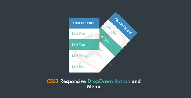
Pure CSS3 Responsive DropDown Button and Menu

CSS3 Responsive DropDown Button
In this tutorial We are going to take a look at a CSS only technique for creating dropdowns.We will create pure css3 DropDown button without a single line of JavaScript.
You can see the example in action in our editor. Click the “HTML” and "CSS" button to see the code. You can Download the full source code from the button above.
You can see the example in action in our editor. Click the “HTML” and "CSS" button to see the code. You can Download the full source code from the button above.
The Markup
This is what our HTML structure looks like. Here it’s important to note, that the input element has to come first, before the label and before the ul. You will understand why this is needed later, when we check out the CSS.
<div class="dropdown">
    <input type="checkbox" id="checkbox_toggle">
    <label for="checkbox_toggle">Click to Expand</label>
    <ul>
        <li><a href="#">Link One</a></li>
        <li><a href="#">Link Two</a></li>
        <li><a href="#">Link Three</a></li>
        <li><a href="#">Link Four</a></li>
    </ul>
</div>
As you can see, there’s nothing out of the ordinary here, all of elements are in standard, frequently used HTML:
- The div will serve as a container for the whole thing.
- The input type=checkbox is needed because of it’s checked/unchecked property. It will be hidden at all times
- The label will be used to toggle the input and will also serve as the trigger for your dropdown.
- The ul is simply a list we want to be visible when the dropdown is extended. Can be any other element.
The CSS
body{
    text-align: center;
    font: 16px/1.5 sans-serif;
    padding-top: 40px;
    background-color: #ECEFF1;
}


.dropdown{
    position: relative;
    display: inline-block;
    font-size: 16px;
    color: #FFF;
}

/**
    Hide the checkbox itself. Checking and unchecking
    it we will be done via the label element.
*/

input[type=checkbox]{
    display: none;
}


/* Click to expand button */

label{
    box-sizing: border-box;
    display: inline-block;
    width: 100%;
    background-color: #57A0D4;
    padding: 15px 20px;

    cursor: pointer;
    text-align: center;
    box-shadow: 0 1px 1px rgba(0, 0, 0, 0.2);

    -webkit-user-select: none;
    -moz-user-select: none;
    -ms-user-select: none;
    user-select: none;
}

input[type=checkbox]:checked ~ ul {
    display: block
}

/*  The ul will have display:none by default */

ul{
    position: absolute;
    list-style: none;
    text-align: left;
    width: 100%;
    z-index: 1;
    margin:0;
    padding:0;
    box-shadow: 0px 1px 1px rgba(0, 0, 0, 0.2);

    display: none;
}


ul li{
    padding: 15px;
    background-color: #fff;
    color: #4FB9A7;
    margin-bottom: 1px;
    cursor: pointer;
}

ul li:hover{
    background-color: #4FB9A7;
    color: #FFF;
}

ul li a{
    color: inherit;
    text-decoration: none;
}


/**

    By using the Following-sibling selector (~),
    we can target elements positioned after our checkbox in the DOM tree.

    With the state pseudo selector (:checked),
    we can make changes depending on the state of the checkbox.

    Using this combination of selectors
    allows to change the color of the label
    and show the list of items
    only when the checkbox is checked.

*/

input[type=checkbox]:checked ~ label {
    background-color: #3D88BD;
}


input[type=checkbox]:checked ~ ul {
    display: block;
}
Hope you enjoyed our quick tip!
Pure CSS3 Responsive DropDown Button and Menu
 Reviewed by Sanaulllah Rais
on
14:07
Rating:
 Reviewed by Sanaulllah Rais
on
14:07
Rating:

No comments: